Ignition Perspective is a premier graphical front-end environment in the SCADA world. It excels at allowing developers to create custom, sleek-looking HMIs.
The styling for every button, text field, or image found on Perspective screens is the same styling language that powers the entire internet. Ignition has default styling for buttons, labels, etc; however, every style is configurable. Developers change colors, font sizes, padding, and many other CSS properties for all of the different types of components on Ignition Perspective views.
Ignition Perspective introduces a Style Graphical User Interface (GUI) that displays a large amount of commonly used style properties in a single easy to use GUI. The Style GUI lets developers intuitively adjust all sorts of styles for components without having to learn any nitty-gritty CSS. Even experienced CSS developers can benefit from how seamlessly this GUI is built into Ignition Perspective's development environment.
Ignition also has a concept of ‘style classes’ that creates a grouping of style properties that can be applied to a component or several components across an entire Ignition Perspective project.
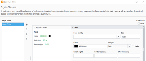
There are some limitations to Ignition’s Style GUI. The largest limitation is that it simply doesn’t encompass every CSS property possible on the web. Powerful properties like ‘Transform’ and ‘Transition’ are absent from the Style GUI. The Style GUI does allow for animations and CSS selectors (Hover, Active, etc.), but the Style GUI animations and selectors are more limited in their capabilities than with pure CSS.
Adding your own CSS in Ignition has been possible for a long time through adding your own custom theme. Using your own custom theme requires a little bit of development overhead. Editing the CSS of your theme wasn’t really possible from the Designer. However, with the release of 8.1.22 Ignition adding custom CSS has never been easier.
Introducing the Stylesheet
The Stylesheet is a plain CSS file easily accessible from the Ignition Designer. To access the Stylesheet, you must be running Ignition 8.1.22 or later version. The Stylesheet must also be enabled in the project browser by right-clicking the Styles folder and enabling the Advanced Stylesheet.
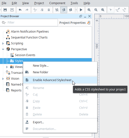
Enabling the Stylesheet will add a stylesheet.css file to the styles folder. This file is where CSS can be directly added to your Ignition Project. It is important to note that CSS written here is only local to the current project where this stylesheet exists. The CSS written here will not exist across the entire gateway and only applies to the current project. Creating your own custom theme may be better suited for CSS applied across the entire gateway.

For now, let’s try making a CSS class that we can use in our Ignition project. For this example, we’ll make a class that rounds its corners of a button and makes the background and border green.

We’ll create a CSS class by beginning with a period(.) to signify that is a class. The CSS class here is called ‘psc-roundedButton’, but throughout our Ignition project it will just be called ‘roundedButton’. We have to prepend all custom classes in the stylesheet with ‘psc-’ because Ignition automatically prepends any custom classes added to components with ‘psc-’. If we want to add give a button this ‘roundedButton’ class we can drop a button on a view and then give the button the ‘roundedButton’ class.

The button should now use the style specified by the ‘roundedButton’ class in the stylesheet. We can make more adjustments to the class in the style sheet as we want. For instance, let’s make the button a little more dynamic by reducing its opacity when hovered over.
We can add the hover selector to the class that will reduce the opacity. Now the button provides some feedback to users when they hover over it.


So far, the class we’ve made doesn’t do anything that Style Classes and the Style GUI can’t already do. Now, let’s jump into something that can’t be done with just Style Classes and the Style GUI. Let’s integrate some properties not found in the Style GUI and discussed in our blog, Custom CSS in Ignition Perspective: Adding Transforms and Transitions.
Let’s add both a transition and a transform to this CSS style class. Let’s have the button scale larger and translate upwards when we hover over it, and then let's have it return to normal when we stop hovering. We can do this with just two more lines of CSS.
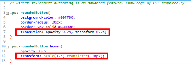
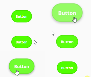
We added a transition to the general class to transition the opacity and transform properties of the button. Then, in the hover selector, we added a transform that both scales the button bigger and moves it upward in the y-direction 10 pixels. This is only one of an infinite number of ways we could style a button with CSS classes, and the limit is really just your imagination.
Let’s provide one more example of making a custom CSS class using some properties that aren’t built into Ignition’s Style GUI. Let’s make a class that will gray scale and blur an image until we hover over it. Once we’re hovering over it, we will show the original image.
Start by making a ‘specialImage’ class and adding the filter property. The filter property can do a variety of things, but here we are adding a Gaussian blur and grayscale. We’ll also add a transition to the filter property. Then, we need to add a hover selector that sets the filter to none. You can see all of the CSS code below.
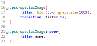
The result is an image that doesn’t show any detail or draw attention until the user hovers over it, and then they can see the full details of the image.

The ‘filter’ CSS property is a property that isn’t accessible from the Ignition Style GUI, so this is another example of functionality that’s currently only possible with pure CSS.
CSS has pretty endless possibilities to experiment with and integrate into your Ignition projects. The internet has a plethora of CSS guides, examples, and inspiration to use for trying new CSS effects.
Learn more about DMC's Ignition programming expertise and contact us today for your next project.